CRM Analytics Charts in Dynamics 365 present large quantities of data in an organization in a more insightful and graphical way. They are built from the query on the data. When the query is updated for the data, the associated charts also get updated automatically. Dynamics 365 includes system CRM Analytics Charts (built-in charts that come with Dynamics 365) and user charts (created by users).
System chart:
System charts in Dynamics 365 Customer Engagement are organization-owned charts and can’t be assigned or shared.
1. Make sure the System Administrator security role or equivalent permissions in Microsoft Dynamics 365 are assigned.
2. Go to Settings > Customizations.
3. Choose Customize the System.
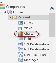
4. To create or edit a system chart, choose Components > Entities.

5. Expand the name of the entity, choose Charts, and then on the Actions toolbar, choose New.

OR
To edit a chart, choose More Actions, and then choose Edit.
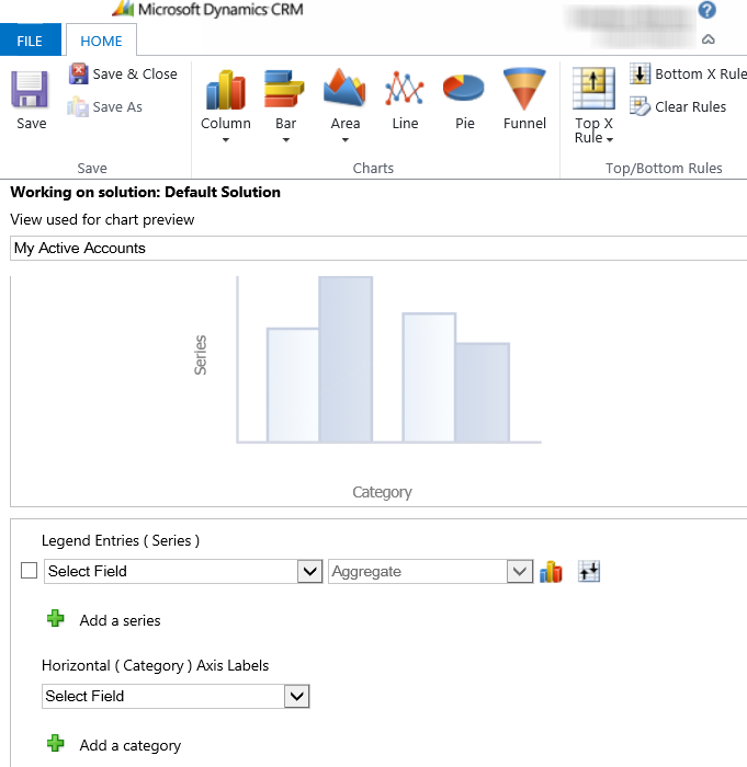
6. Select a view to use for chart preview.
7. Specify the type of chart, and how the data is displayed in the chart.
- Choose the chart name to edit it.
- Select fields for the series and category axes.
- Add a description to identify the purpose of the chart.
8. Choose Save.
User chart:
Create a chart:
1. Go to work area.
2. Open the chart designer:
3. Define the properties of the chart.
4. To specify a different name for the chart, choose the chart name to edit it.
5. To save the chart, in the chart designer, choose Save.
Specify what to display on the chart:
1. In the first drop-down box under Legend Entries (Series), select a field to display on the series axis.
2. In the Aggregate drop-down box, choose the option by which the field is to be grouped that was selected in Legend Entries (Series).
3. To create a chart with multiple series, choose the Add a series icon add_series, select another field to display on the series axis, and then select an aggregate option for that series.
4. To change the chart type for a series, select the series, choose the Current chart type icon for that series, and then select a chart type.
5. To stack items in a chart, choose the chart type, and then choose Stacked or 100% Stacked. It is possible to stack items only in a bar, column, or an area chart.
6. To display only top items on the chart, choose the Top/Bottom Rules icon > Top X Rule icon, > Top 3 or Top 5, or Custom to specify a different number.
7. From the list under Horizontal (Category), select the field to display on the category axis.
8. To create a comparison chart with multiple categories, choose the Add a category icon add_series, and then select another field to display on the category axis.
9. For fields that are of the datetime type, choose the option by which the field is to be grouped that was selected as the category.
Edit a chart:
1. Go to work area.
2. Open the chart designer:
3. Modify the properties of the chart.

